Wendys-SQ-Crop.jpg
 

STRATEGY.

IDENTITY.

RETAIL DESIGN.

GRAPHIC DESIGN.

PACKAGING.

EXTREME MAKEOVER


How do you evolve a well-loved and time-tested brand and make it relevant to today’s consumers?

wendys_interior01.jpg

WENDY’S STOCK PRICE LIFT

525%

IN 9 YEARS.

(LENGTH OF TESSER RELATIONSHIP)


110%

FOR THE 2012 IMAGE ACTIVATION RESTAURANTS…THE DINING ROOM SALES ARE UP CLOSE TO 110%, CARRYOUT SALES UP IN AREA OF 55% AND PICKUP WINDOW UP 15%.

EMIL BROLICK, NRN


EVOLVING AN AMERICAN ICON: IDENTITY MAKEOVER
 

When tackling the evolution of a well-loved and time-tested icon, Tesser knew it was critical to respect the existing equities, while signaling meaningful change. Her age, her hair and her clothing all needed to signal authenticity while being relevant to the next generation of square hamburger lovers. The result is a grown-up image, as beautiful as ever. 

Wendys_Logo_OLD.png
Wendys_Logo_NEW.png
Wendys_Logo_NEW_Hover.png

JOSHUA JOHNSON.

DESIGN SHACK

{orange} The new logo is an excellent update.


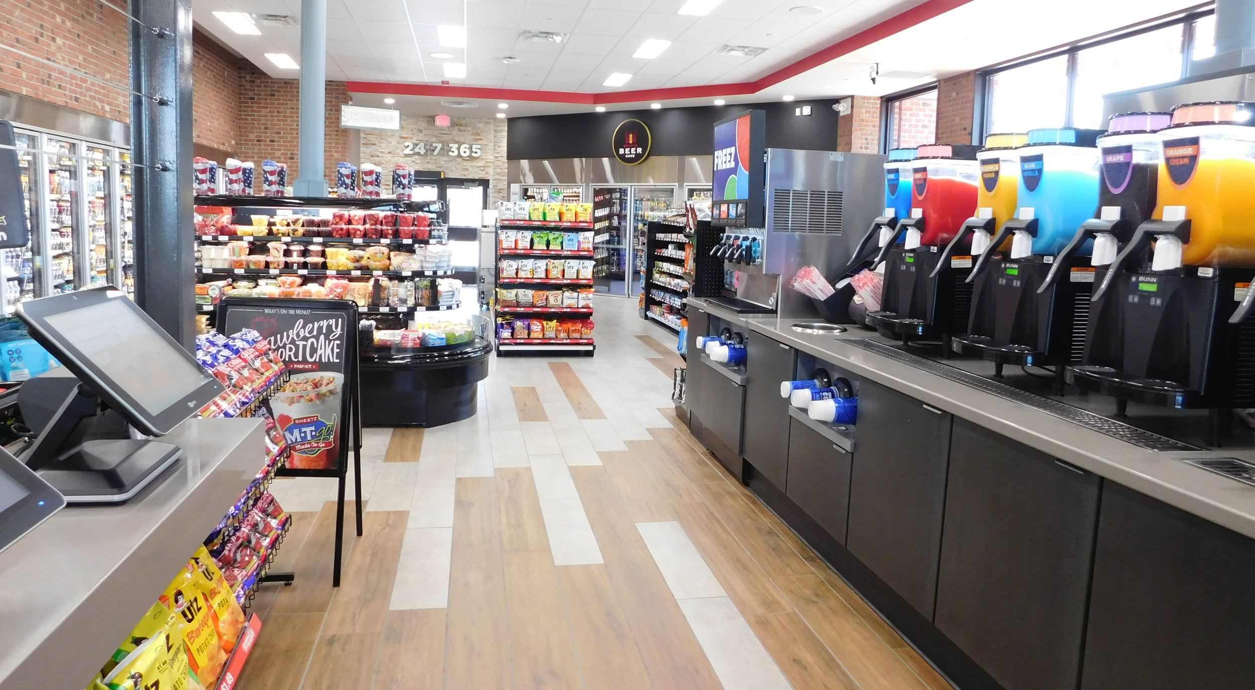
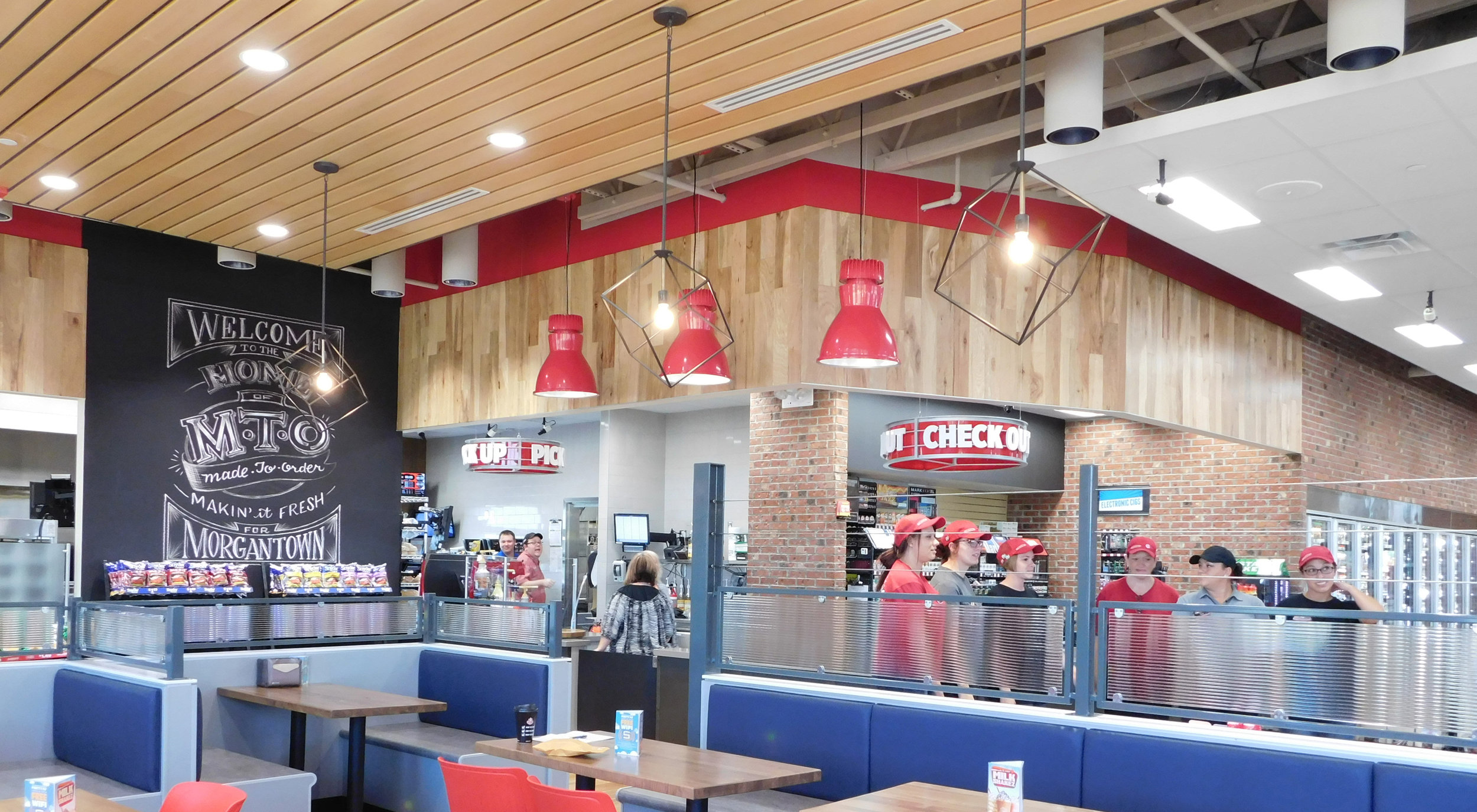
CREATING A BEACON: STORE DESIGN PHASE


Tesser created four distinct restaurant prototypes from a common design strategy: UltraModern, Contemporary, Urban, and Traditional. Wendy’s decided to implement all four prototypes in regions across the country to measure customer response and evaluate the practicality, functionality and operational efficiency of the designs.  


The UltraModern design was deemed the best to reflect the “Real” Wendy’s, which became known as the Image Activation prototype. The store’s unique features include a dynamic modernist design, innovative customer flow, a fireplace, café-style booths and free wifi — meeting the everyday cravings and comforts of the modern consumer. 


wendys_sketch.jpg
wendys_process.jpg
wendys_exterior.jpg

CHRIS NICHOLS.

YAHOO FINANCE

2013

Restaurant Stock of the Year
wendys_interior02.jpg
wendys_interior03.jpg

DAVID KARAM.

FORMER PRESIDENT OF

NORTH AMERICA WENDY’S

{orange} The new restaurant design is outstanding. It impacts the entire customer experience and updates Wendy’s image while maintaining our focus on quality.
wendys_3concepts.jpg


KEEPING THE MOMENTUM: GLOBAL IMAGE ACTIVATION


For Wendy’s, the Image Activation was more than a remodel. It was a long-term initiative. So long-term, that Wendy’s and its franchisees implemented Tesser’s work across 521 North America system restaurants and built 99 new North America restaurants and 50 new International restaurants in 2016. At the end of 2016, approximately 32% of the global system features the new, “Real” Wendy’s image.
 

wendys_international.jpg

TODD PENEGOR.

CEO & PRESIDENT,

THE WENDY’S COMPANY

PRNEWSWIRE

We have now recorded 16 consecutive quarters of positive same-restaurant sales and total new restaurant openings have accelerated in both North America and International with nearly 150 new restaurants opened globally in 2016. As a result of our brand transformation efforts and with the support from our franchise partners, the Wendy’s system has never been stronger.
B&J-SQ-Crop.jpg
 

STRATEGY.

RETAIL DESIGN.

PACKAGING.

MENU SYSTEM.

SPREAD GLOBAL EUPHORIA


How do you make a legendary ice cream brand cool for a new generation? Once accomplished, how do you then launch an iconic American brand across the world’s leading cities?

B&JMain-CROP.jpg

10%

STORES THAT REMODEL SEE A 10% BOOST IN SALES.

DEBRA HEINTZ
GLOBAL DIRECTOR OF RETAIL SCOOP SHOPS
FORTUNE.COM


#1

CONSUMER PICK IN THE LIMITED SERVICE CATEGORY

NATION’S RESTAURANT NEWS, 2016


START AT THE SOURCE: FLAGSHIP STORE, BURLINGTON, VT
 

Tesser’s design for Ben & Jerry’s Scoop Shops returns to the brand’s roots, updating it with a “green” high-tech air. Ben & Jerry’s pioneering application of re-used materials is reflected throughout the store, from the pint lid “flavor curtain” to the video screens mounted inside a VW Bus. High-margin treats take center stage while décor elements fabricated by Vermont artisans tell the brand’s social mission story. We call it “Global Cooling!”
 

B&J-1-CROP.jpg
B&J-3-CROP.jpg
B&J-2-CROP.jpg
B&J-4-CROP.jpg

Ellen Kresky.

Creative Director

Ben & Jerry’s

{orange} Tesser did an amazing job of translating our complex brand into a retail store which is uniquely Ben & Jerry’s!

TAKING THE MESSAGE GLOBAL: TOKYO & BEYOND


Through in-depth pop-culture analysis and pushing Ben & Jerry’s into a new, upscale position. Authentic materials, high quality finishes, digital communication and interactive features are woven throughout the store design. The sophisticated Japanese customer is fully engaged with Ben & Jerry’s heritage, quality product, social mission and the communal experience of eating ice cream. And with lines around the block, success is no surprise.
 

B&J-sketch-CROP.jpg
B&J-7-CROP.jpg
B&J-5-CROP.jpg
B&J-6-CROP.jpg
B&J-8-CROP.jpg

Ellen Kresky.

Creative Director

Ben & Jerry’s

The Tokyo scoop shop has been one of the busiest in our system. It’s no coincidence.

SPREADING THE LOVE: AMSTERDAM, BRAZIL & SINGAPORE


With the success of the Tokyo store came the request for more store designs worldwide.  Tesser introduced the brand into brand new markets by building an in-store experience to capture the essence of the founder’s personalities and drive awareness of new products and super-premium quality.


By working with local artists and craftsmen, Tesser helped Ben & Jerry’s artfully blend it’s core brand elements with the styles of the adopted country. 

B&J-9-CROP.jpg
B&J-10-CROP.jpg
B&J-11-CROP.jpg

PACKAGING

Tesser created a cohesive packaging suite that amplified the core brand personality items used throughout the system, including signature phrases like “Peace, Love & Ice Cream.”

B&J-Packaging-CROP.jpg
 

AWARDS

award.png

2015 A.R.E. LIGHTING AWARD,
BRAZIL STORE

award.png

2015 WINNER OF THE SHOP!
DESIGN AWARD FOR LIGHTING

award.png

2015 HUB PRIZE

SINGAPORE POP-UP

award.png

2012 GDUSA MAGAZINE FEATURE,

PACKAGING

 
Chilis-SQ-Crop.jpg
 

STRATEGY.

IDENTITY.

RETAIL DESIGN.

PACKAGING.

GRAPHIC DESIGN.

PEPPER IN PROFITS


The time had come for the iconic global brand to spice up their logo & store design. Luckily, Tesser brought the heat.


Tesser was called in to rebrand their identity and remodel the Chili’s stores. Tesser blended the company’s authentic Texas roots with contemporary adult appeal, and a less cartoony feel. The revitalized brand — one of consumers top 15 casual dining restaurants — is capturing new customers while re-engaging their existing fans to visit more often. 

ChilisMain-CROP.jpg

1000

0VER 1000 UNITS REMODELED IN THE CURRENT SYSTEM (DOMESTICALLY AND INTERNATIONALLY) AND STILL GROWING.


Chilis_Logo_OLD.png
Chilis_Logo_NEW.png
Chilis_Logo_NEW_Hover.png

KAREN ROBINSON-JACOBS.

KNAPP-TRACK

DALLAS NEWS

{orange} On average over the past 12 months, Chili’s has scored 2 percentage points higher than the casual dining average on sales and 2.5 percentage points higher on guest visits.
Chilis-1-CROP.jpg
Chilis-3-CROP.jpg
Chilis-2-CROP.jpg
Chilis-4-CROP.jpg
 
Popeyes-SQ-Crop.jpg
 

STRATEGY.

RETAIL DESIGN.

GRAPHIC DESIGN.

SPICE UP SALES


Popeyes Louisiana Kitchen, the second-largest quick-service chicken restaurant group, offers food made from scratch, however their existing store design was not resonating that message with customers.


Tesser was brought on board to spice up the Popeyes store design, aligning it to their brand values, retaining their heritage and their food made from scratch ideals. Tesser created a high-impact design based on Popeyes’ authentic Louisiana culinary roots and their rich and varied menu. Tesser created an entirely new dining experience featuring dynamic branding elements, eclectic materials, hand-drawn messages and a feature wall of authentic Cajun spices. The store is now as welcoming as any Louisiana kitchen!

PopeyesMain-CROP.jpg

STOCK PRICE LIFT OF

503%

IN JUST 4 YEARS


90%

OF STORES REMODELED WITH TESSER'S DESIGN


CHERYL BACHEDLER.

CEO POPEYES

{orange} Design that makes the food taste better.
Popeyes-1-Crop.jpg
Popeyes-3-Crop.jpg
Popeyes-2-Crop.jpg
Popeyes-4-Crop.jpg


LOUISIANA GOES GLOBAL
 

For Popeyes’ international expansion into Asia and South America, Tesser developed a freestanding design to be a beacon for the brand. The eclectic style of the building is a modern take on authentic, rural Louisiana architecture. The interior’s vibrant colors and tone of voice are inspired by Louisiana Zydeco music. The artpack messaging is modified to resonate on a global level. It celebrates the joy of food and music and their ability to bring together a community.
 

PopeyesExterior-CROP.jpg
 
Sheetz-SQ-Crop.jpg
 

STRATEGY.

RETAIL DESIGN.

BRINGING FOOD FORWARD


As a family-owned convenience store, Sheetz had a strong desire to shift their consumers’ focus from “a gas station that happens to sell food” to “a convenience restaurant that happens to sell gas”.

SheetzMain-CROP.jpg

20%

LIFT IN FOOD AND BEVERAGE SALES ABOVE HIGHEST GROSSING STORES WITHIN THE SYSTEM


Tesser’s next generation design brought a new guest experience through a restaurant-centric store and brings the “Made-to-Order” component front and center within the space.  The full reconfiguration of the space featured vastly improved sightlines to the kitchen area and their first integrated dine-in area. Additionally, a separate entry was added to the marketplace to lift grab-and-go sales and to create a simplified and more intuitive experience.


Sheetz-1-CROP.jpg
Sheetz-3-CROP.jpg
Sheetz-2-CROP.jpg
Sheetz-4-CROP.jpg
 
MFOC-SQ-Crop.jpg
 

STRATEGY.

IDENTITY.

PACKAGING DESIGN.

WEB DESIGN.

PROMOTIONS.

OLIVES FOR EVERYONE


How do you hook the customer in a low involvement Consumer Packaged Goods Category?
 

As the leading supplier of table olives in America, the Musco Family Olive Co. has launched several lines of products with Tesser’s help. From guiding the strategy to naming and packaging design, these include the popular line of Pearls® Olives to Go! – a convenient and mess-free snack option for families, to Specialties California Grown, featuring the diverse and premium flavors of California Olives. Through its ongoing work, Tesser’s involvement with Musco Family Olives continues to see the launch of new exciting products, most recently, Pearls® Infused Olives, a line of bold and exciting flavors offered in Tesser designed packaging. 

MFOC_cup.jpg

PARENTS MAGAZINE NAMES NEW PEARLS® OLIVES TO GO!™ SNACK CUPS ONE OF ITS

25

BEST PACKAGED FOODS FOR FAMILIES.


BOASTING OVER A

15

YEAR RELATIONSHIP WITH MUSCO FAMILY OLIVES, TESSER HAS HELPED LAUNCH OVER A DOZEN PRODUCTS.


MFOC_products.jpg

FELIX MUSCO.

CEO

MUSCO FAMILY OLIVE CO.

{orange} Tesser was instrumental in helping us carve out a clear position with first-rate brand strategy and creative execution.
MFOC_digital.jpg
MFOC_adjacent.jpg
MFOC_prima.jpg
MFOC_sns.jpg
 
Savers-SQ-Crop.jpg
 

STRATEGY.

IDENTITY.

RETAIL DESIGN.

RESTYLE WITH PURPOSE


Savers Thrift Stores did little to connect emotionally and deliver inspiration to shoppers and donors with their generic logo, sterile environments and unclear messaging.


Tesser created a new brand positioning built around the “power of reuse” which informed a store design that ”walks the talk” through reclaimed materials and decor, and a bit of quirky personality sprinkled throughout. Savers core beliefs are represented in a new icon inspired by store tags and reuse, each representing a different aspect of the business — empowerment of nonprofits, great value and protection of the planet. 

savers_heart.jpg

SINCE 2006, SAVERS’ REVENUE
HAS MORE THAN DOUBLED TO

$1.2

BILLION

MOODY’S INVESTOR’S SERVICE


TESSER DESIGN FEATURED IN INTERNATIONAL RETAIL DESIGN CONFERENCE BREAKOUT SESSION IN

2017


Savers_Logo_OLD.png
Savers_Logo_NEW.png
Savers_Logo_NEW_Hover.png
savers_signage.jpg

KARIN KOONINGS.

FORMER CMO

SAVERS

This icon, custom wordmark–the repurposed “a” and “e”–and tagline, help to convey that Savers is about much more than a great find.
savers_interior01.jpg
savers_interior03.jpg
savers_interior02.jpg
savers_interior04.jpg

KARIN KOONINGS.

FORMER CMO

SAVERS

{orange} Developing impactful designs through mission-centric brand positioning is building consumer loyalty among existing customers, as well as new audiences, increasing revenue and establishing Savers as a thought leader in the ‘do good’ space.
 
CEC-SQ-Crop.jpg
 

STRATEGY.

IDENTITY.

COLLATERAL.

RETAIL DESIGN.

FUN FOR ALL


How does the beloved 40-year-old Chuck E. Cheese brand, evolve its store experience to remain relevant and fun for the next generation of parents and families while remaining the place “where a kid can be a kid”?


Chuck E. Cheese partnered with Tesser to help remodel several of its flagship stores. Tesser created a more inviting experience for adults without compromising the fun factor for kids. By opening up sight lines to the kitchen and creating a more food-driven pizzeria restaurant ambiance via warm woods and neutral tones, Tesser was able to help showcase a higher food quality perception. And as the final “topping”, Tesser also designed the logo and wordmark to feel more iconic, hand-done and authentic. 

CEC-News-CROP.jpg

Fourth quarter earnings are soaring to a profit of almost

$53m

That's a 600% increase from previous year earnings in all remodeled store locations!


Tom Leverton.

Chuck E. Cheese CEO

{orange} I’m really excited about highlighting all the changes.
CEC_Logo_OLD.png
CEC_Logo_NEW.png
CEC_Logo_NEW_Hover.png
CEC-1-CROP.jpg
CEC-2-CROP.jpg
CEC-3-CROP.jpg
CEC-4-CROP.jpg

Michael Hartman.

Chuck E. Cheese CMO

We’re excited to partner with Tesser to remodel our iconic stores.
CEC-5-CROP.jpg
 
Noahs_MainSQ.jpg
 

STRATEGY.

COLLATERAL.

RETAIL DESIGN.

TOP NOSH


Noah’s Bagels is a beloved West Coast brand with a rich story, although its guest experience had become outdated, and the brand wasn’t attracting a new generation of customers.


Tesser helped reposition Noah’s as an accessible, premium breakfast destination with a dash of New York chutzpah. A new store design and graphic approach elevated the warmth and sense of community Noah’s is known for, while introducing bold pops of personality to infuse the environments with energy.


This new design highlights the bagel oven as the heart of the restaurant, and refines the order flow for an easier guest experience with great views to the action in the kitchen. A new exterior acts as a brand beacon, helping Noah’s stand out amidst the competitive “noise” of its inline locations.  

Noahs_Main.jpg

Tyler Ricks.

President

NOAH'S NY BAGELS

{orange} Our team enjoyed collaborating with Tesser on this project. Their design captures the energy of the original Noah’s concept while both elevating and modernizing the environment.
noah's_crop2.jpg
noah's_crop1.jpg
noah's_crop3.jpg
noah's_crop4.jpg

Teka O'Rourke.

Marketing VP

NOAH'S NY BAGELS

Our goal was really to make sure that, when someone walks in, they would feel that it’s still a Noah’s but feel that it’s more contemporary.
noah's_crop_exterior.jpg
 
01-Exterior-Prototype-copySQ.jpg
 

STRATEGY.

RETAIL DESIGN.

GRAPHIC DESIGN.

AMERICA'S DINER


Are we talking about the same America’s Diner that has been around since Dwight D. Eisenhower’s first year in the White House? That’s the kind of question chief marketing officer John Dillon wants customers to ask as they sit down to a meal at one of Denny’s 1,735 restaurants around the country.


Part of the luxury and challenge, quite frankly, of having an almost 65-year-old brand is you have high awareness, no question, but a lot of that awareness has been based on past efforts. It’s the brand you thought you knew, but it's changed.


One noticeable change is the continuation of Denny’s Heritage remodel program. About 67 percent of the entire system has been updated to the refreshed look, which Miller said generated a significant sales lift over legacy stores. 

01-Exterior-Prototype-MAIN.jpg

80%

Projected system adoption of Tesser design for 2018 


JOHN DILLON.

CMO

DENNY'S

{orange} These updates give outlets a more ‘old fashioned diner’ feel, and create a warmer, more welcoming atmosphere.
02-Exterior-Prototype-with-Pole-sign-copy.jpg
06-LocalMural-copy.jpg
05-Counter-copyCROP.jpg
03-Facade-copy.jpg
 
AuntieAnnes_MainSQ.jpg
 

STRATEGY.

COLLATERAL.

RETAIL DESIGN.

CLASSIC WITH A TWIST


Baked fresh every thirty minutes, Auntie Anne’s pretzel is made from scratch and hand-rolled one at a time.

The business was also built one store at a time by Anne and her family. Tesser brings this authentic, caring, hard-working story to life with the new store design in a warm and welcoming kitchen setting. There are delightful touches of copper and natural cues of wood and stone. And the warming case and oven are given pride of place. An Auntie Anne’s pretzel is more than a snack—it’s a reward. And now more than ever so is the visit to Auntie’s kitchen!

AuntieAnnes_Main.jpg

Bill Dunn.

President & COO

AUNTIE ANNE’S

{orange} We are very proud of the new look and pleased that it has received a positive reception from franchise partners, landlords and suppliers.
AuntieAnnes_Crop1.jpg
AuntieAnnes_Crop2.jpg
AuntieAnnes_Crop3.jpg
AuntieAnnes_Crop4.jpg

Bill Dunn.

President & COO

AUNTIE ANNE’S

Although the look is new, we stayed true to our brand messaging and rich company history of freshly baking pretzel products from scratch all day long.
 
BOJANG_MainSQ.jpg
 

STRATEGY.

COLLATERAL.

RETAIL DESIGN.

UN-BO-LIEVABLE


A beloved southeastern regional brand with a recent IPO and regional growth strategy, Bojangles’ wanted to elevate its guest experience and amplify its distinct product offering.


Tesser designed an impactful store and guest experience around the brand’s signature items; such as highly visible biscuit preparation in the “biscuit theater” located directly behind the order counter and a prominent display of their freshly prepared chicken. The overall look and feel successfully balanced Bojangles’ proud southern heritage with a clean sophistication. It also positioned the brand well to grow from a super-regional brand to national one.


BOJANG_Main1.jpg

6.2%

Increase in total revenue as compared to previous fiscal year. 


Randy Icard

VP of Construction & Development

{orange} It was a big part of our overall strategy to not just have a new building, but to have something that would reflect our heritage and be new and modern.
BOJANG_Crop1.jpg
BOJANG_Crop2.jpg
BOJANG_Crop4Vert.jpg

Randy Icard

VP of Construction & Development

This new design concept represents our commitment to operational excellence and enhancing the consumer experience at our restaurants.
BOJANG_ExteriorNight.jpg
BOJANG_Crop3Vert.jpg